Brand development and corporate design for Trull GmbH.
Trull GmbH supports companies in developing and successfully implementing sustainable growth strategies. Trull is characterised by strong implementation expertise and an international network of experts to create holistic solutions.
As part of a neuromarketing workshop using the Limbic® approach, the target groups Performers and Disciplined were defined – demanding business partners with a focus on efficiency, reliability and success.
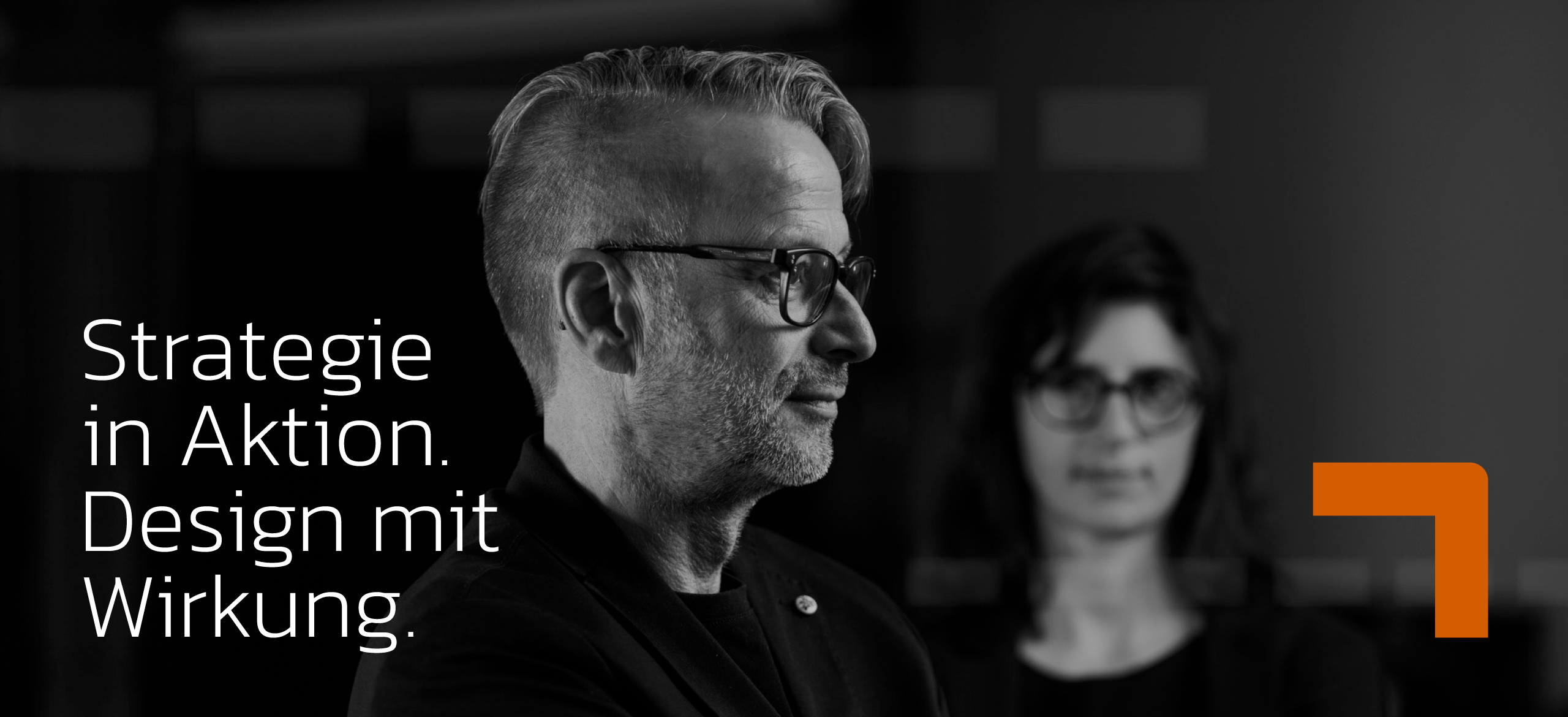
On this basis, we developed a strong brand: A wide typeface visualises strategy and implementation expertise, an orange arrow symbolises growth. The high-contrast colours black and orange emphasise Trull GmbH’s claim to leadership, while the black and white image style lends the corporate design expressiveness and recognition value. A modern website rounds off the appearance.
You are currently viewing a placeholder content from Facebook. To access the actual content, click the button below. Please note that doing so will share data with third-party providers.
More InformationYou are currently viewing a placeholder content from Instagram. To access the actual content, click the button below. Please note that doing so will share data with third-party providers.
More InformationYou are currently viewing a placeholder content from Instagram. To access the actual content, click the button below. Please note that doing so will share data with third-party providers.
More InformationYou are currently viewing a placeholder content from X. To access the actual content, click the button below. Please note that doing so will share data with third-party providers.
More Information