ACTIVATING, EYE-CATCHING & SIMPLY DIFFERENT.
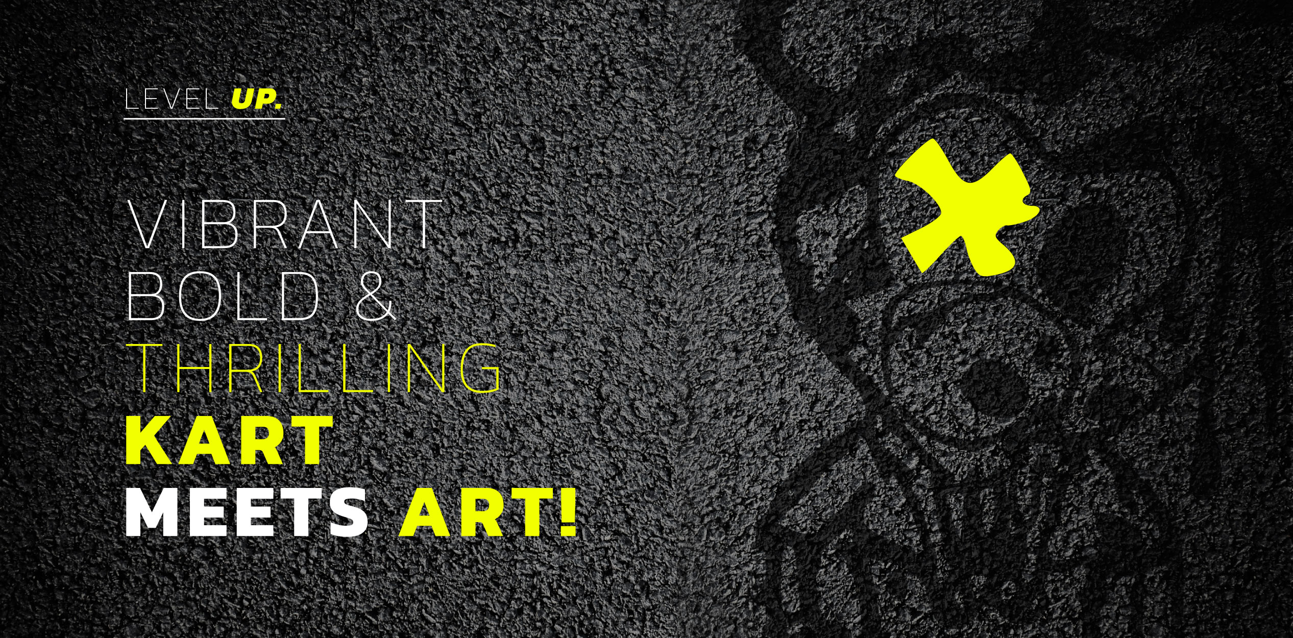
Karting meets graffiti, adrenalin meets art: an innovative business concept that is also reflected in the unique brand identity of our client Airfield.
The clear and dynamic Airfield Art Kart logo is stylistically and typographically inspired by racing, with subtle echoes of the GTA aesthetic without copying it. It stands for itself and is complemented by the street art-inspired addition ‘Mendig City’. The mouse as a figurative mark functions as an artistic symbol and, together with the activating neon colours, contributes significantly to the unmistakable brand identity of Airfield Art Kart.
This powerful branding feeds into follow-up projects such as the website and photo and video production and merges into an adrenaline-fuelled, unmistakable unit.
You are currently viewing a placeholder content from Facebook. To access the actual content, click the button below. Please note that doing so will share data with third-party providers.
More InformationYou are currently viewing a placeholder content from Instagram. To access the actual content, click the button below. Please note that doing so will share data with third-party providers.
More InformationYou are currently viewing a placeholder content from Instagram. To access the actual content, click the button below. Please note that doing so will share data with third-party providers.
More InformationYou are currently viewing a placeholder content from X. To access the actual content, click the button below. Please note that doing so will share data with third-party providers.
More Information